Introduction
In today’s data-driven world, businesses are inundated with vast amounts of data. Transforming this data into actionable insights is crucial for making informed decisions. This is where data visualization plays a pivotal role. By presenting complex data in a visual format, businesses can quickly grasp trends, patterns, and outliers, enabling more effective decision-making.
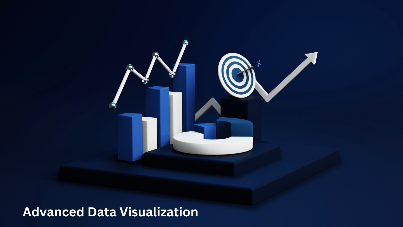
Advanced data visualization techniques elevate the capabilities of traditional methods, providing more dynamic, interactive, and detailed representations of data. From interactive dashboards to geospatial visualizations, these techniques offer powerful ways to explore and communicate data. This blog post delves into some of the most impactful advanced data visualization techniques for business intelligence, showcasing their benefits, tools, and real-world applications.
Interactive Dashboards
Interactive dashboards are a cornerstone of modern business intelligence, providing a dynamic and user-friendly way to explore and analyze data. Unlike static reports, interactive dashboards allow users to engage with data in real time, offering a more intuitive and insightful experience.
Definition and Benefits
An interactive dashboard is a visual interface that displays key data points, metrics, and trends in a consolidated view. Users can interact with the data through filters, drill-downs, and other interactive elements to gain deeper insights. These dashboards transform complex datasets into intuitive visual formats that make data exploration more accessible and effective.
One of the primary benefits of interactive dashboards is the ability to perform real-time data analysis. Businesses can monitor performance metrics continuously, allowing for immediate responses to emerging trends or issues. This real-time capability is particularly valuable in fast-paced environments where timely decisions are critical.
Interactive dashboards also enhance user engagement. By allowing users to manipulate the data and view it from different perspectives, these dashboards encourage deeper exploration and understanding. This interactivity can lead to more informed decision-making and greater overall engagement with the data.
Customization is another significant advantage of interactive dashboards. They can be tailored to meet the specific needs of different users or departments, ensuring that everyone has access to the most relevant data. This customization can range from simple filter adjustments to completely different visualizations for various user roles.
Efficiency is greatly improved with interactive dashboards. By consolidating multiple data sources into a single view, users save time and effort that would otherwise be spent compiling and interpreting disparate reports. This streamlined access to information facilitates quicker and more effective analysis.
Tools and Platforms
There are several powerful tools and platforms available for creating interactive dashboards, each offering unique features and capabilities. Some of the most popular include:
- Tableau: Known for its robust features and user-friendly interface, Tableau allows users to create highly interactive and visually appealing dashboards. It supports a wide range of data sources and provides extensive customization options, making it a preferred choice for many organizations.
- Power BI: A Microsoft product, Power BI integrates seamlessly with other Microsoft tools and provides strong data connectivity and visualization options. It offers a range of interactive features and is particularly well-suited for organizations already using Microsoft’s ecosystem.
- Qlik Sense: Qlik Sense offers advanced data analytics and visualization capabilities, with a focus on user-driven exploration and discovery. Its associative model allows users to uncover hidden relationships within their data, providing deeper insights.
- Looker: Acquired by Google, Looker provides a modern data platform that allows for custom data modeling and interactive dashboard creation. It integrates well with Google’s cloud services and offers powerful data exploration tools.
Each of these tools brings its own strengths to the table, making them suitable for different types of businesses and use cases. The choice of tool often depends on the specific needs and existing infrastructure of the organization.
Case Studies of Successful Implementations
Interactive dashboards have been successfully implemented across various industries, driving significant improvements in data analysis and decision-making. Here are a few examples:
In the retail sector, a major retail chain implemented interactive dashboards to track sales performance and customer behavior in real time. By visualizing sales data across different regions and stores, the company was able to quickly identify trends and optimize inventory management. This led to increased sales and reduced costs, as the company could more accurately forecast demand and adjust their supply chain accordingly.
In healthcare, a provider used interactive dashboards to monitor patient outcomes and operational efficiency. By visualizing key metrics such as patient wait times, treatment effectiveness, and resource utilization, the organization was able to identify areas for improvement and enhance patient care. This data-driven approach led to better patient outcomes and more efficient use of resources.
In the finance industry, a financial services firm utilized interactive dashboards to analyze market trends and portfolio performance. By visualizing data in real time, the firm could make more accurate forecasts and better investment decisions. This not only improved portfolio performance but also increased client satisfaction, as clients could see the transparent and data-driven approach taken by the firm.
Interactive dashboards are transforming the way businesses interact with their data, making it easier to uncover insights and drive strategic initiatives. As technology continues to evolve, the capabilities of these dashboards will only expand, offering even greater potential for enhancing business intelligence.

Geospatial Visualization
Geospatial visualization, also known as geographic information system (GIS) visualization, is a powerful technique that combines spatial data with traditional data to create maps and other geographic representations. This approach allows businesses to visualize data in a geographic context, uncovering patterns and relationships that might not be evident in traditional charts or tables.
Explanation and Applications
Geospatial visualization involves plotting data points on a map to show how different variables interact across various locations. This technique is particularly useful for understanding regional trends, optimizing logistics, and making location-based decisions. It leverages geographic coordinates and other location-based data to provide a comprehensive view of spatial relationships within the data. The ability to visualize data in a spatial context is critical for businesses that operate across different regions or that rely on geographic factors to drive decision-making.
One of the primary applications of geospatial visualization is in sales and marketing. Businesses can analyze customer distribution, market penetration, and sales performance across different regions to identify opportunities for growth and target marketing efforts more effectively. For instance, a company might use geospatial data to determine which regions have the highest customer density and tailor their marketing campaigns to those areas, maximizing reach and impact.
In supply chain management, geospatial visualization helps in tracking shipments, optimizing delivery routes, and managing inventory locations. By visualizing the movement of goods and materials, businesses can identify inefficiencies and streamline operations. For example, a logistics company might use geospatial data to optimize delivery routes based on real-time traffic conditions, reducing delivery times and operational costs.
Urban planning is another area where geospatial visualization is invaluable. City planners and developers use geospatial data to analyze traffic patterns, population density, and infrastructure needs, aiding in the creation of more sustainable and livable urban environments. This data-driven approach allows for better resource allocation and more informed decisions about infrastructure development.
Environmental monitoring is a growing field that benefits greatly from geospatial visualization. Organizations can monitor environmental changes, such as deforestation, pollution, and natural disasters, to inform policy decisions and conservation efforts. By visualizing environmental data, researchers and policymakers can identify trends and implement strategies to mitigate negative impacts on the environment.
Tools and Techniques
Several tools and techniques are available for creating geospatial visualizations, ranging from specialized GIS software to general data visualization platforms. Key tools include:
ArcGIS: Developed by Esri, ArcGIS is a comprehensive GIS platform that offers advanced mapping and spatial analysis capabilities. It is widely used in various industries for detailed geospatial analysis. ArcGIS provides tools for creating interactive maps, performing spatial analysis, and integrating various data sources. Its robust functionality makes it a go-to choice for many organizations.
Google Maps API: Google Maps provides robust mapping tools that allow developers to embed interactive maps into their applications. The API offers a versatile solution for many businesses, enabling them to integrate geographic data into their digital platforms. Google Maps API is particularly useful for applications that require real-time mapping and location services.
Tableau: Tableau includes geospatial visualization features that enable users to create interactive maps and integrate geographic data with other data sources for comprehensive analysis. Tableau’s user-friendly interface and powerful visualization capabilities make it a popular choice for businesses looking to leverage geospatial data without needing specialized GIS software.
QGIS: QGIS is an open-source GIS application that provides powerful mapping and spatial analysis tools. It is an accessible option for organizations with limited budgets. QGIS supports a wide range of data formats and offers extensive customization options, making it suitable for various geospatial analysis tasks.
Industry-Specific Examples
Geospatial visualization has been successfully applied in numerous industries, demonstrating its versatility and impact. Here are a few industry-specific examples:
In retail, a large retail chain used geospatial visualization to analyze store performance and customer demographics across different regions. By mapping sales data against population density and income levels, the company identified underperforming stores and optimized their marketing strategies. This led to increased revenue and more efficient allocation of marketing resources.
In telecommunications, a telecom company leveraged geospatial visualization to map network coverage and customer service requests. This allowed them to identify coverage gaps and prioritize network upgrades, improving service quality and customer satisfaction. By visualizing service data geographically, the company could make more informed decisions about where to invest in infrastructure improvements.
In logistics, a global shipping company utilized geospatial visualization to track shipments in real-time and optimize delivery routes. By analyzing traffic patterns and weather conditions, they were able to reduce delivery times and operational costs. This not only improved efficiency but also enhanced customer satisfaction by providing more reliable delivery services.
Geospatial visualization provides a unique and powerful way to analyze data through a geographic lens, uncovering insights that can drive strategic decisions and operational improvements. Its ability to combine spatial data with traditional datasets makes it an invaluable tool for businesses across various industries. As data becomes increasingly location-aware, the importance and utility of geospatial visualization will continue to grow.
Heat Maps and Tree Maps
Heat maps and tree maps are two advanced data visualization techniques that offer unique ways to represent complex data sets. These visualizations help businesses to identify patterns, trends, and outliers by providing a clear and intuitive view of the data.
Understanding Heat Maps
A heat map is a data visualization tool that uses color to represent data values in a two-dimensional space. Each cell in a heat map represents a data point, with the color intensity reflecting the magnitude of the value. This technique is particularly useful for showing the density or intensity of data across a spectrum, making it easy to spot correlations and anomalies.
Applications and Benefits
Heat maps are incredibly versatile and can be applied in various business contexts. In website analytics, heat maps are used to visualize user behavior. By tracking where users click, scroll, or hover, businesses can understand which areas of their site are most engaging and identify potential issues with user experience. For example, a heat map might reveal that users frequently click on non-clickable elements, indicating a need for redesign.
In sales performance analysis, heat maps can visualize sales data across different regions or stores. This helps businesses identify high-performing areas and those that need improvement. A retail chain might use a heat map to compare sales across different locations, helping to pinpoint regions with higher demand or uncovering underperforming stores.
Operational efficiency can also be improved using heat maps. In manufacturing, for instance, heat maps can display machine performance or production line efficiency, highlighting areas that require maintenance or optimization. By visualizing operational data, businesses can quickly identify bottlenecks and allocate resources more effectively.
Tools and Techniques
There are several tools available for creating heat maps. Google Analytics, for example, offers heat map functionalities to track and visualize user interaction on websites. Hotjar is another popular tool that allows businesses to create heat maps and record user sessions to analyze website behavior. Tableau provides robust heat map visualization options, enabling users to customize and analyze their data effectively.
Case Study: E-commerce Website Optimization
An e-commerce company used heat maps to analyze user interactions on their website. By visualizing click data, they discovered that users frequently clicked on non-clickable elements, indicating confusion. They also identified areas with low engagement, prompting a redesign of the site layout. As a result, user satisfaction increased, and conversion rates improved significantly.
Understanding Tree Maps
A tree map is a visualization that displays hierarchical data using nested rectangles. Each branch of the hierarchy is represented by a rectangle, with smaller rectangles nested inside representing sub-branches. The size and color of each rectangle can be used to convey additional information, such as value or category.
Applications and Benefits
Tree maps are particularly useful for visualizing large, hierarchical data sets. In financial analysis, tree maps can be used to visualize portfolio allocations or revenue breakdowns by product lines. This helps businesses identify areas of high performance and potential risk. For example, a financial advisory firm might use a tree map to show asset allocation across various categories and subcategories, providing clients with a clear and comprehensive view of their investments.
In resource management, tree maps can track resource allocation across projects or departments, ensuring efficient use of assets. A company might use a tree map to visualize the distribution of resources, helping to identify areas where resources are over-allocated or underutilized.
Market analysis also benefits from tree maps. Businesses can visualize market share by segment, helping them understand their position relative to competitors. For instance, a tree map could display market share data for different product categories, enabling a company to identify which segments are most competitive and where there are opportunities for growth.
Tools and Techniques
Several tools are available for creating tree maps. Microsoft Power BI offers tree map visualizations that integrate well with other business intelligence tools. Tableau provides flexible tree map options that can be customized to suit specific data sets and analytical needs. For more advanced and interactive tree maps, D3.js, a JavaScript library, allows for the creation of custom visualizations for web applications.
Case Study: Investment Portfolio Management
A financial advisory firm used tree maps to visualize client investment portfolios. By displaying asset allocation across various categories and sub-categories, they provided clients with a clear and comprehensive view of their investments. This visualization helped in identifying overexposure to certain sectors and informed rebalancing strategies, leading to more diversified and resilient portfolios.
Use Cases and Benefits
In healthcare, hospitals can use heat maps to track patient flow and identify bottlenecks in emergency rooms. By visualizing patient admissions, waiting times, and treatment durations, healthcare providers can optimize staff allocation and improve patient care.
In retail, a large retail chain used tree maps to analyze sales data across product categories and subcategories. This helped them identify top-selling products and underperforming items. By visualizing inventory levels and sales performance, they made informed decisions about promotions and stock management.
Heat maps and tree maps offer powerful ways to visualize and analyze complex data sets, providing insights that drive strategic decisions and operational improvements. Their ability to highlight patterns and relationships makes them invaluable tools for businesses across various industries.
Network Diagrams
Network diagrams are a vital tool in the realm of business intelligence, particularly for visualizing and analyzing the relationships and flows between different entities. These diagrams can represent a wide range of data, from organizational structures to social networks and information systems, offering a clear view of how components interact within a system.
Definition and Significance
A network diagram is a graphical representation of a network’s nodes and the connections between them. Nodes represent individual entities, such as people, departments, or devices, while the links between nodes represent relationships or interactions. Network diagrams can vary in complexity from simple graphs to intricate, multi-layered structures, depending on the data and the specific analysis needs.
The significance of network diagrams lies in their ability to reveal hidden patterns and relationships that might not be apparent in tabular data. By visualizing how entities are connected, businesses can gain insights into the dynamics of their operations, communication flows, and organizational structures. This can lead to more informed decision-making and strategic planning.
Applications and Benefits
Network diagrams have broad applications across various industries and can be used to address multiple business challenges. In IT and telecommunications, network diagrams are essential for mapping out and managing infrastructure. They help in visualizing the layout of networks, identifying potential points of failure, and optimizing network performance. For instance, a company might use a network diagram to map out its data centers, routers, and switches, ensuring that all components are effectively connected and functioning.
In organizational management, network diagrams can illustrate reporting structures, collaboration patterns, and communication flows. This is particularly useful for large enterprises where understanding the interplay between different departments and teams is crucial. By visualizing these relationships, companies can streamline workflows, enhance communication, and identify bottlenecks. For example, a network diagram might reveal that certain departments are overly dependent on a single team, highlighting a potential risk that needs to be addressed.
Social network analysis is another key application of network diagrams. Businesses can use these diagrams to analyze customer interactions, influencer networks, and market dynamics. By understanding how individuals and groups are connected, companies can tailor their marketing strategies, improve customer engagement, and identify key influencers within their target markets. A social media company, for instance, might use network diagrams to analyze the spread of information and identify influential users who can drive engagement.
In project management, network diagrams (often called PERT charts) are used to visualize project tasks, timelines, and dependencies. This helps project managers to plan and monitor project progress, ensuring that tasks are completed on schedule and resources are allocated efficiently. A project manager might use a network diagram to map out the sequence of tasks, identify critical paths, and allocate resources to ensure timely project completion.
Tools and Best Practices
Several tools are available for creating and analyzing network diagrams, each offering unique features suited to different types of networks and analysis needs. Some of the most popular tools include:
Gephi: An open-source network analysis and visualization software, Gephi is widely used for exploring and understanding complex networks. It provides powerful tools for graph manipulation, spatialization, clustering, and more. Gephi is suitable for both small and large networks, offering a range of visualization options and analytical capabilities.
Microsoft Visio: Known for its ease of use and integration with other Microsoft Office products, Visio is a popular choice for creating professional network diagrams. It offers a wide array of templates and shapes for various types of networks, making it a versatile tool for business applications.
Pajek: Another tool for large network analysis, Pajek is designed to handle networks with millions of nodes and edges. It offers advanced analytical capabilities and supports various types of network visualizations. Pajek is particularly useful for researchers and analysts dealing with extensive and complex networks.
Graphviz: An open-source graph visualization software, Graphviz allows users to create network diagrams using simple text-based descriptions. It is highly customizable and supports a wide range of graph types and layouts, making it a powerful tool for detailed network analysis.
Best practices for creating effective network diagrams include:
- Clear Objectives: Define the purpose of the network diagram and the key insights you aim to achieve. This helps in selecting the appropriate type of diagram and the data to include.
- Accurate Data: Ensure that the data used for creating the network diagram is accurate and up-to-date. Inaccurate data can lead to misleading visualizations and poor decision-making.
- Simplicity: While network diagrams can become complex, strive to maintain simplicity and clarity. Avoid overcrowding the diagram with too many nodes and connections, and use visual cues such as colors and shapes to highlight key elements.
- Interactive Elements: Incorporate interactive elements where possible to allow users to explore the network in more detail. Interactive features can include zooming, filtering, and tooltips that provide additional information about nodes and connections.
- Regular Updates: Network diagrams should be updated regularly to reflect changes in the underlying data. This ensures that the visualizations remain relevant and useful for ongoing analysis.
Real-World Applications
In the healthcare industry, network diagrams are used to map out patient referral patterns and collaboration among healthcare providers. By analyzing these networks, healthcare organizations can improve care coordination, identify gaps in service, and enhance patient outcomes.
In cybersecurity, network diagrams help in visualizing and monitoring network security. By mapping out the network infrastructure and identifying potential vulnerabilities, organizations can proactively address security threats and enhance their defense mechanisms.
Network diagrams provide a comprehensive view of relationships and flows within a system, offering valuable insights that drive strategic decisions and operational improvements. Their versatility and analytical power make them essential tools for businesses across various industries.
Time Series Analysis
Time series analysis is an essential technique in business intelligence that focuses on analyzing data points collected or recorded at specific time intervals. This method is particularly valuable for identifying trends, seasonal patterns, and cyclical behaviors in data over time. By leveraging time series analysis, businesses can make more accurate forecasts, optimize operations, and gain deeper insights into their performance and growth.
Importance of Visualizing Time Series Data
Visualizing time series data allows businesses to see changes and trends over time, which is crucial for understanding past performance and predicting future outcomes. Unlike static data, time series data is dynamic and continuous, capturing the essence of how certain metrics evolve. This temporal aspect provides a richer context for analysis, revealing patterns that may not be visible in aggregated or snapshot data.
For instance, a retailer analyzing monthly sales data can identify peak seasons, sales dips, and growth trends over several years. This information can guide inventory management, marketing campaigns, and resource allocation. Similarly, in finance, time series analysis of stock prices, interest rates, or economic indicators helps in making informed investment decisions and risk assessments.
Techniques and Tools
Several techniques are used in time series analysis, each with specific applications depending on the nature of the data and the analysis goals. Key techniques include:
Moving Averages: This technique smooths out short-term fluctuations and highlights longer-term trends by averaging data points over a specified period. Moving averages are widely used in financial markets to analyze stock prices and in operations to track performance metrics.
Exponential Smoothing: This method gives more weight to recent observations while smoothing out the data. It is useful for making short-term forecasts and is often employed in inventory management and sales forecasting.
Decomposition: Decomposition involves breaking down a time series into its component parts: trend, seasonality, and residuals (irregular fluctuations). This technique helps in understanding the underlying patterns in the data and making more accurate forecasts.
ARIMA (Autoregressive Integrated Moving Average): ARIMA is a sophisticated statistical technique used for modeling and forecasting time series data. It combines autoregression (AR), differencing (I), and moving average (MA) components to capture various aspects of the data’s temporal structure. ARIMA models are particularly powerful for complex forecasting tasks.
Seasonal Decomposition of Time Series (STL): STL is a robust technique that decomposes a time series into seasonal, trend, and residual components. It is highly flexible and can handle data with complex seasonal patterns, making it ideal for various industries such as retail and manufacturing.
Prophet: Developed by Facebook, Prophet is an open-source forecasting tool designed to handle time series data with daily observations that display strong seasonal effects and multiple seasons of historical data. It is user-friendly and provides accurate forecasts even with missing data or outliers.
Tools for Time Series Visualization
Several tools facilitate the visualization and analysis of time series data. Popular options include:
Tableau: Tableau offers robust capabilities for visualizing time series data through line charts, area charts, and more. It allows users to interactively explore data trends and patterns over time, making it a preferred choice for business analysts.
Power BI: Microsoft Power BI provides comprehensive tools for time series analysis, including custom visuals and built-in forecasting features. Its integration with other Microsoft products makes it a versatile option for businesses already using the Microsoft ecosystem.
R and Python: Both R and Python offer extensive libraries for time series analysis and visualization. In R, packages like forecast, tseries, and ggplot2 are widely used, while Python’s pandas, statsmodels, and matplotlib provide powerful tools for handling time series data.
Excel: For simpler time series analyses, Excel remains a popular choice due to its accessibility and familiarity. Excel’s built-in functions, such as moving averages and exponential smoothing, along with its charting capabilities, make it a practical tool for basic time series visualization.
Examples from Various Industries
Retail: A large e-commerce company uses time series analysis to forecast demand for different product categories. By analyzing historical sales data, the company identifies seasonal trends and adjusts inventory levels accordingly, reducing stockouts and excess inventory.
Finance: An investment firm leverages time series analysis to predict stock prices and market trends. Using ARIMA models, the firm analyzes historical price movements and volatility, providing insights that inform trading strategies and risk management.
Healthcare: Hospitals use time series analysis to monitor patient admissions and predict peak times. By understanding patterns in patient arrivals, hospitals can optimize staffing levels and improve patient care during busy periods.
Manufacturing: A manufacturing company employs time series analysis to forecast production needs and maintenance schedules. By analyzing machine performance data over time, the company can predict when equipment is likely to fail and schedule preventive maintenance, minimizing downtime.
Energy: Utility companies analyze energy consumption patterns to forecast demand and optimize energy distribution. Time series analysis helps these companies understand peak usage times and plan for energy production accordingly, ensuring a stable supply.
Real-World Case Study: Airline Industry
An airline uses time series analysis to forecast passenger demand and optimize flight schedules. By analyzing historical booking data, the airline identifies trends and seasonal patterns in passenger travel. This information allows the airline to adjust flight frequencies, manage crew schedules, and optimize ticket pricing. As a result, the airline improves operational efficiency and enhances customer satisfaction by offering flights that align with demand patterns.
Time series analysis provides a powerful framework for understanding and forecasting temporal data. By leveraging these techniques and tools, businesses can gain valuable insights into trends, patterns, and future outcomes, enabling more informed decision-making and strategic planning.
Conclusion
In conclusion, the application of time series analysis in forecasting passenger demand and optimizing flight schedules demonstrates the significant impact data-driven insights can have on operational efficiency and customer satisfaction within the airline industry. By harnessing historical booking data to identify trends and seasonal patterns, airlines can make informed decisions regarding flight frequencies, crew schedules, and ticket pricing. This approach not only improves operational efficiency but also enhances customer experience by aligning flight offerings with demand patterns. Ultimately, time series analysis serves as a powerful tool for businesses to gain valuable insights, make informed decisions, and strategically plan for the future.
More Reading
- Data visualization techniques for business intelligence
- Advanced data visualization methods,
- Interactive data visualization tools,
- Geospatial data visualization,
- Actionable insights from data visualization,
- Data visualization trends,
- Dynamic data visualization,
- Advanced data visualization applications,
- Visualizing data for decision-making,
- Transforming data into visual insights,
- Benefits of advanced data visualization,
- Interactive dashboard design,
- Leveraging data visualization for informed decisions,
- Enhancing decision-making through data visualization.